Author


Article Highlights
- Experimental federal data show low-income households experience roughly 10 percent higher inflation over time than highest-income households
- Difference widens when considering ability to substitute; surveys show much greater pain felt by low-income households
- Income group feeling highest inflation at any moment varies as source of cost-pressures changes
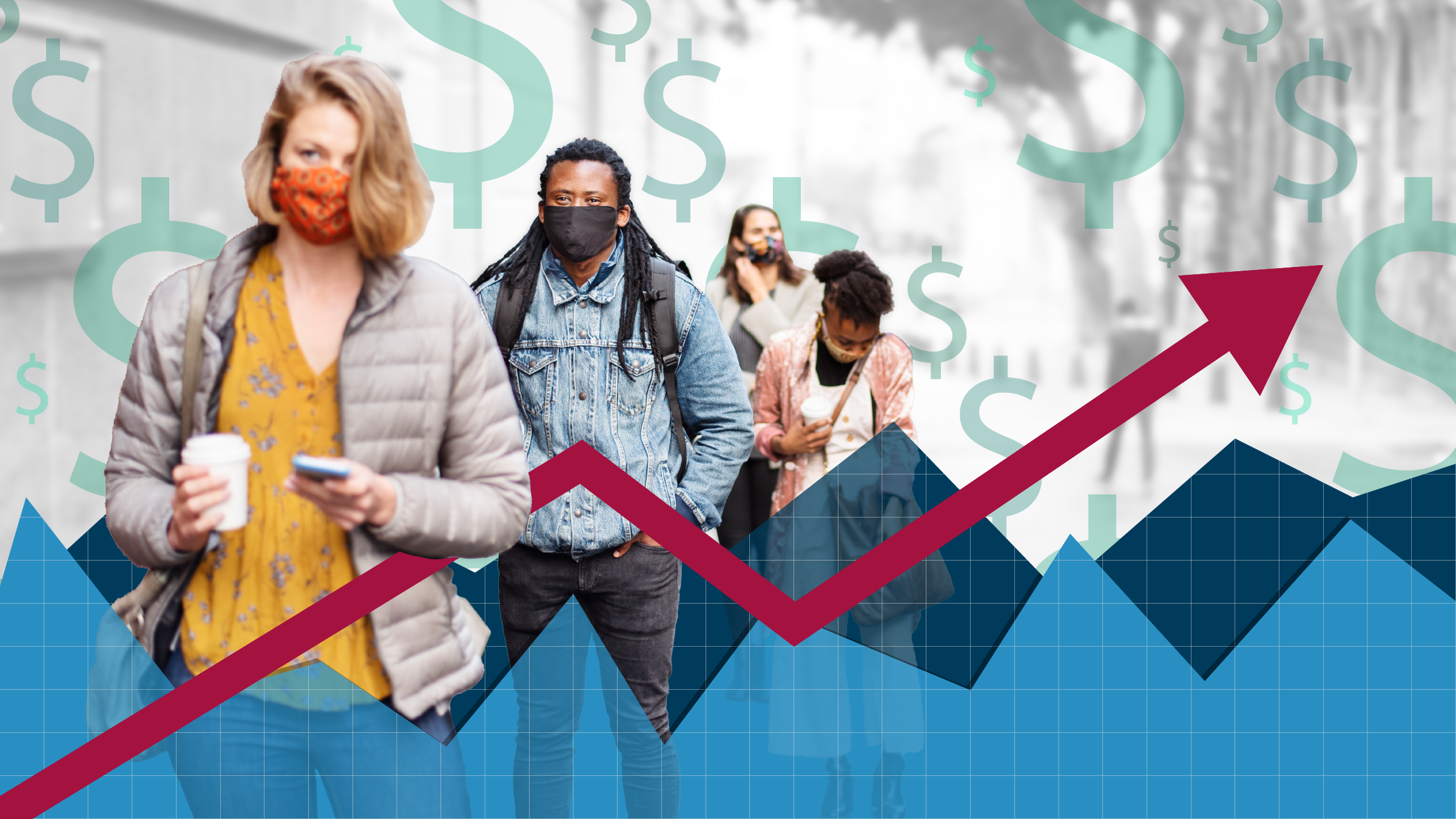
Until the COVID-19 pandemic, attempts to measure inflation for different subgroups were rare. Core U.S. inflation (which excludes volatile food and energy prices) had been fluctuating in a narrow range around 2 percent since the mid-1990s. Core personal consumption expenditures inflation, the Fed’s preferred gauge, last topped 5 percent in 1983. Even as interest exploded in disparate experiences in employment and other economic indicators, inflation in general was neither a pressing policy issue nor the hottest research topic.
One notable exception was an experimental price index for Americans over 62, maintained by the U.S. Bureau of Labor Statistics (BLS) after an order from Congress in 1987. And in the late 2010s, some notable papers used barcode scanner data to measure varying inflation rates for certain store-bought consumer goods. When I wrote about the state of “varied inflation” research in early 2022, prices were spiking as in the 1970s, and the disparate effects of inflation had suddenly become a lot more interesting.
Two years and one historic surge-of-inflation later, we have actual macroeconomic data to explore, including experimental, ongoing data releases from the federal government, New York Fed, and private researchers. These datasets merge granular price data with ongoing expenditure surveys that record how different households allocate their budgets. For the first time, we can consider whether inflation—like employment—is a starkly different story for different groups of Americans.
Over time, prices rise more for lower-income households
This article will focus on inflation-by-income (reserving race and other demographics for a future piece). On this front, the BLS now publishes the “research consumer price index for equivalized income quintiles” (R-CPI-I), retroactive to 2005.1 First, the long view: How much have different income groups seen prices rise since the start of this data series (Figure 1)?
Let’s zoom in on the recent bout of U.S. inflation, looking at prices since the COVID pandemic (Figure 2).
| Household income quintile | 0%–20% | 21%–40% | 41%–60% | 61%–80% | 81%–100% |
| Inflation (Feb. 2020–June 2024) | 22.5% | 22.3% | 21.9% | 21.5% | 20.5% |
By the end of this inflationary period, the poorest households have seen prices rise about 2 percentage points more than the richest ones—or about 8.3 percent faster than the average consumer price index (CPI) over this period. It might not sound like much amid a historic rise in inflation for everyone. However, a few caveats are important.
First, any generalized inflation statistics are likely very different from the experience of any specific family. An essential insight from the barcode scanner research from the 2010s is that the inflation rates from one family to another can be vastly different, even if they share the same demographics.3
Second, this measure does not reflect the varying ability of households to substitute. Lower-income families may have less flexibility to adjust their spending as prices rise. They are more likely to devote more spending to household necessities in proportion to discretionary purchases; they are probably already buying low-cost brands.
The BLS’ experimental “chained” CPI-by-income series (R-C-CPI-I) is meant to reflect changes in the household consumption basket over time, although this more complex series lags by about a year and requires more assumptions about household behavior. With this effort to factor in substitution, everyone’s inflation rate is lower over the life of the series (Figure 3). But the differences are somewhat larger across income groups, with an almost 11 percentage point gap between the poorest and richest households.
One more valuable point: Even modest changes in purchasing power over time can compound simultaneous changes in income. Economist Xavier Jaravel at the London School of Economics has developed his own “distributional consumer price indices” with an approach broadly similar to the BLS. In an early-stage paper, Jaravel finds that while the household income gap between the top and bottom quintiles grew 16 percent between 2002 and 2019, this measure of income inequality grew almost 23 percent when he factors in disparate inflation rates.
As expected, this difference is larger when he uses a chained CPI formula. Jaraval further finds that another 2.3 million Americans would be below the poverty line if we accounted for their higher rates of inflation.
The group with the worst inflation is not always the same
While low-income households have seen larger price increases over the long haul, at any given moment middle- or upper-income households might be faring the worst. This view of the BLS data series shows that different income quintiles experience the highest inflation in any given year (Figure 4).
This view also reinforces that, with some exceptions (notably the Great Recession years of 2007–2009 and the recent post-COVID inflation) the dispersion has typically been small. Most groups experience broadly similar inflation most of the time. Higher inflation for low-income households accumulates slowly, over many years of being slightly above average.
Behind the trends: Transportation and shelter
Along with the BLS and Jaravel, a third recent resource on disparate inflation rates comes from the New York Fed, which last year launched its quarterly “Equitable Growth Indicators” report covering a range of economic data. They divide their income buckets differently, which allows different patterns to emerge from the post-pandemic inflationary episode (Figure 5).
In the first year of the pandemic, prices were rising the most for lower-income households, while middle-income households had lower price growth. Notably, this was a time when the price of gasoline and durable goods initially fell (in anticipation of a longer recession), while prices of food—a large component of low-income household budgets—generally did not.
In 2021, as overall inflation picked up, the tables had turned on middle-income households who devote a higher share of budgets to transportation. Middle-income consumers felt the most severe inflation at a time when microchip shortages drove up the price of new and used cars and the war in Ukraine sent gas prices to historic highs.
However, housing consumes a larger share of expenses for low-income households. By mid-2022, sustained growth in rent, home and renters’ insurance, and home prices (tracked by the BLS via “owner-equivalent rent”) contributed to low-income households again experiencing the highest rates of inflation. The highest-income households, by contrast, enjoyed below-average inflation through the worst of the post-pandemic surge, according to the New York Fed data.
Price index numbers don’t fully capture the strain of inflation
At the national peak of inflation in June 2022, the BLS data tell us that the middle quintile of households by income were experiencing inflation at a 19 percent annualized rate; the lowest-income households were not far behind at 18.6 percent, and the highest-income at around 16 percent.4 Everyone was seeing rapid price increases in most categories.
Shortly after this, the U.S. Census Bureau’s Household Pulse Survey introduced a new question: What is the level of stress caused by the increase in prices in the last two months? Here we see much more than a few percentage points separating low-, middle-, and high-income Americans (Figure 6).
At this moment of peak inflation, 64 percent of low-income respondents found it “very stressful.” Only 17 percent of the richest were highly stressed. Twenty-one percent weren’t stressed at all.
The latest Household Pulse Survey from July 2024 shows some compression. With pandemic savings depleted and a widespread decline in financial security, middle- and upper-income families are actually more stressed now than when inflation was considerably worse. Even so, lower-income households remain much more pained by rising prices.
“All Americans are confronting higher prices, but the burden is particularly great for households with more limited resources,” said then–Fed Vice Chair Lael Brainerd, opening a spring 2022 inflation-focused conference for the Minneapolis Fed’s Opportunity & Inclusive Growth Institute. “We are only beginning to understand the ways in which inflation experiences vary from household to household, how this variation correlates with income and demographic information, and how these divergent inflation experiences change over time.”
In the short time since Brainerd’s remarks, valuable new data have come online—giving policymakers the missing evidence to understand how inflation is far from a one-size-fits-all challenge.
Endnotes
1 A summary of the approach from BLS economists Joshua Klick and Anya Stockburger: “We define income groups by using equivalized household income (income that accounts for household size). … We use integrated data from the two independent surveys composing the Consumer Expenditure Surveys (CE)—the Diary Survey and the Interview Survey—to form expenditure shares at the basic-index level for each cohort. … To estimate inflation by cohort, we aggregate price changes for the urban population by using cohort-specific weights calculated from expenditure weights.”
2 As measured by the “consumer price index for all urban consumers” (CPI-U), the appropriate BLS benchmark series.
3 See “Inflation at the household level” (Journal of Monetary Economics, 2017) by Greg Kaplan and Sam Schulhofer-Wohl.
4 These numbers correspond to monthly increases in the R-CPI-I in June 2022 of 1.46 percent (middle-income households), 1.43 percent (lowest income), and 1.42 percent (highest income). Annualized data expresses month-to-month price increases at the rate that would result if they continued for a year.
Jeff Horwich is the senior economics writer for the Minneapolis Fed. He has been an economic journalist with public radio, commissioned examiner for the Consumer Financial Protection Bureau, and director of policy and communications for the Minneapolis Public Housing Authority. He received his master’s degree in applied economics from the University of Minnesota.