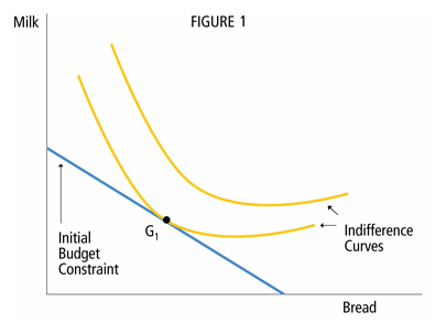
We can understand how the Slutsky equation decomposes changes in demand with the help of diagrams originally used by economist John Hicks. Start by assuming for simplicity that there are only two goods, bread and milk. In figure 1, the quantity of bread is represented on the horizontal axis, and milk is on the vertical axis.

The straight diagonal line connecting the two axes is called the budget constraint. It represents all the combinations of bread and milk a consumer can afford. For example, if bread costs $2 a loaf and milk costs $3 a gallon, then a consumer with $60 can afford 30 loaves of bread or 20 gallons of milk or any combination in between—say, 15 loaves and 10 gallons. (Of course, with $60 the consumer can also afford any lesser bundle of goods, to the southwest of the budget constraint, such as 5 loaves and 2 gallons.)
The curved lines in figure 1 represent combinations of bread and milk that give the consumer the same level of utility—that is, happiness or satisfaction. So, the consumer might be equally pleased with, say, 15 loaves and 10 gallons or 20 loaves and 8 gallons, both points on a given curve. Economists call these “indifference curves” because each curved line is the set of all bundles of goods for which the consumer is “indifferent.” Curves further to the northeast represent higher levels of utility.
To maximize utility, a consumer will purchase the combination of goods represented by point G1, where an indifference curve exactly touches (is tangent to) the budget line. To understand why, note first that the consumer can’t afford bundles on any indifference curves further northeast of the budget line. Utility-maximizing consumers would purchase a bundle on the budget line; otherwise, they would be wasting some of their budget. But any point on an intersection between an indifference curve and the budget line other than point G1 is a lower level of utility. Point G1 therefore is the highest level of utility a consumer with the given preferences and budget can afford at going prices.
When prices change
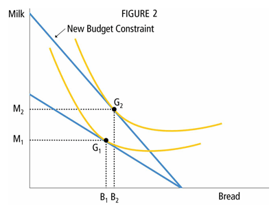
What if prices change? Consider a decrease in the price of milk from $3 a gallon to $2. In the graph, this changes the slope of the budget line, since consumers can now afford up to 30 gallons of milk if they buy no bread. Given the consumer’s preferences, the consumer will now purchase the bundle of goods given by point G2 in figure 2, where the new budget constraint is tangent to the highest possible indifference curve. This amounts to purchasing M2 gallons of milk instead of the original M1. And bread purchases will change from B1 to B2.
But just how the quantities of individual goods purchased changes depends on preferences, and this is where Slutsky’s analysis was pathbreaking.

He pointed out that when the price of a good changes, there are two effects. When one good becomes less expensive, the consumer is likely to use more of it. Because milk has become cheaper, consumers would probably substitute milk for bread in their daily diet. Thus, the “substitution” effect.
But since a decrease in the price of milk means the consumer can buy the previous quantity of milk for less and still have money left for any other purchase, this has an effect similar to an increase in the consumer’s income: the “income effect.”
Slutsky’s equation breaks down changes in demand due to price changes into these two components: income and substitution effects.
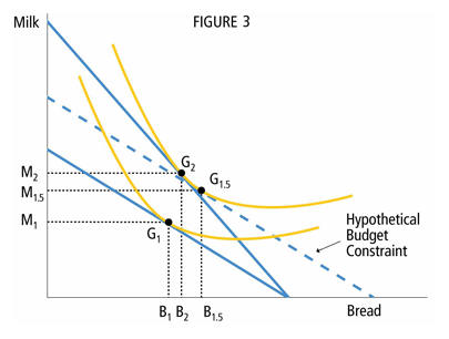
To see how, note that the higher utility a consumer reaps when the price of milk falls could have been achieved by increasing income sufficiently to reach the higher-utility indifference curve, represented in figure 3 by a parallel shift of the initial budget constraint. But this hypothetical increase in income would result in a purchase of the groceries represented by point G1.5, where the higher indifference curve is tangent to the parallel budget constraint. The difference in quantities purchased of milk from M1 to M2 gallons is the income effect of the price change.

But this doesn’t account for the substitution effect, due to the new relative prices of milk and bread. That’s represented by the changing slope of the budget constraint due to the change in relative prices. The shift along the higher-utility indifference curve from G1.5 to G2 (from M1.5 to M2 gallons of milk, and B1.5 to B2 loaves of bread) is due to this shift in relative prices. This is the substitution effect.
Joe Mahon is a Minneapolis Fed regional outreach director. Joe’s primary responsibilities involve tracking several sectors of the Ninth District economy, including agriculture, manufacturing, energy, and mining.


